


WhatsApp is rolling out a pretty substantial design update for both its iOS and Android apps, but we bet the company hoped for a slightly warmer welcome of the new design on X.
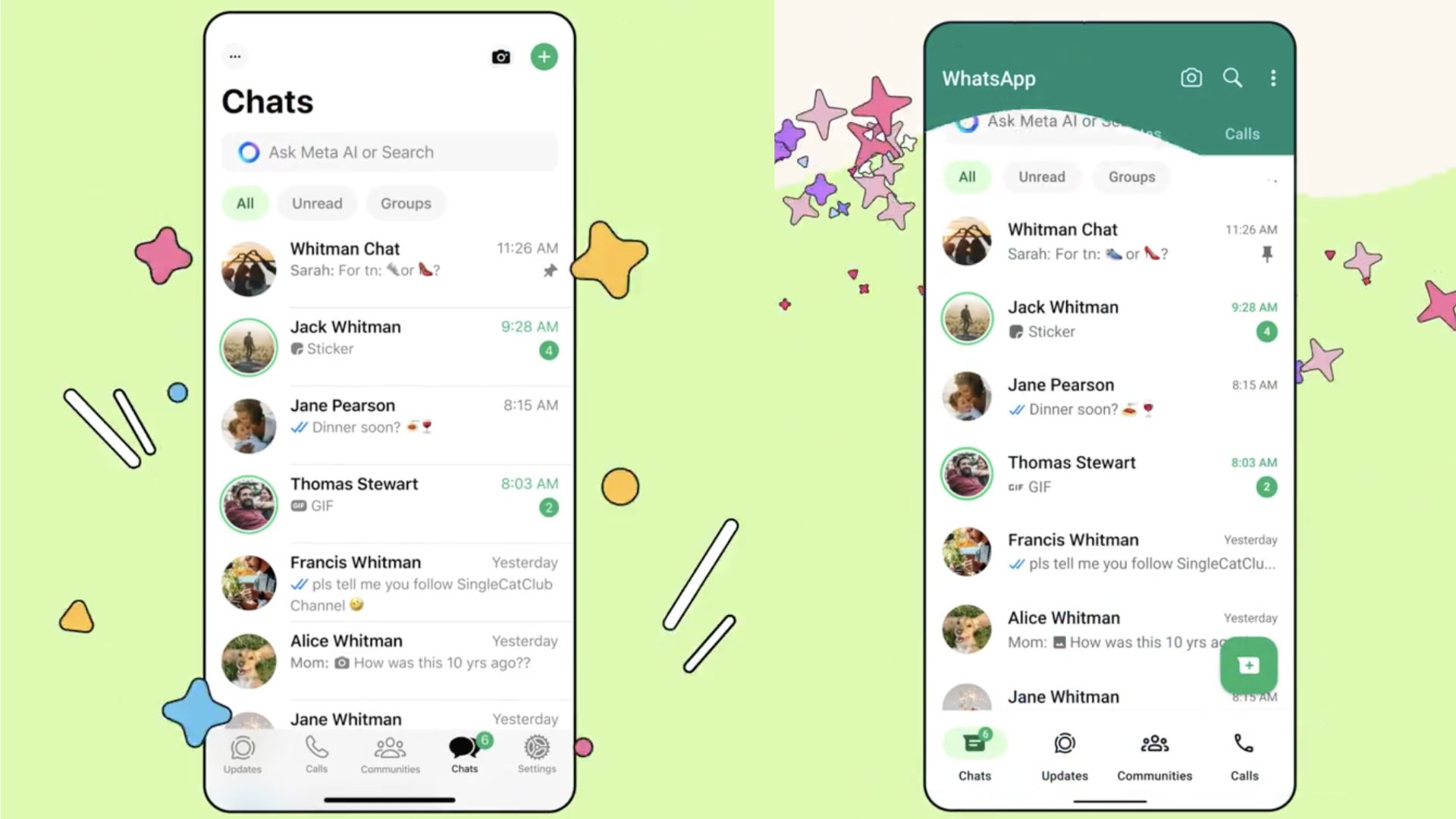
The new layout, which is similar on iOS and Android, isn’t a radical departure. The search is more prominent on top of the app, below it, tabs let you quickly access unread messages and groups, and on the bottom, a row of icons lets you access Chats, Updates, Communities and other features (to be fair, this is a bigger change on Android, which didn’t have the bottom row of icons until now).
But WhatsApp users on iOS have noticed a big visual change: The predominant color accent on everything is now green instead of blue (on Android, the app was already predominantly green).
It makes sense to have the same visual identity across the same app on two mobile platforms, but as it so often happens, the change irked some commenters on X, which balked at the freshly green WhatsApp experience.
“I seriously freaked out when that green came into my face. We need the blue back,” wrote one commenter. “I still have the blue and I hope it stays like this forever,” wrote another.
“BRING THE BLUE BACK,” one person on X cried in horror.
I didn’t get the new design yet, my WhatsApp iOS app is still blue, and it’s hard to say just how traumatic this greenification of WhatsApp will be for me. I do like the blue, too, though.
Notably, a number of commenters below WhatsApp’s announcement on X noted that the company keeps updating its iPhone app very frequently, but still hasn’t got an iPad app. What’s up with that, WhatsApp?


